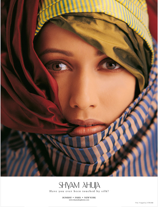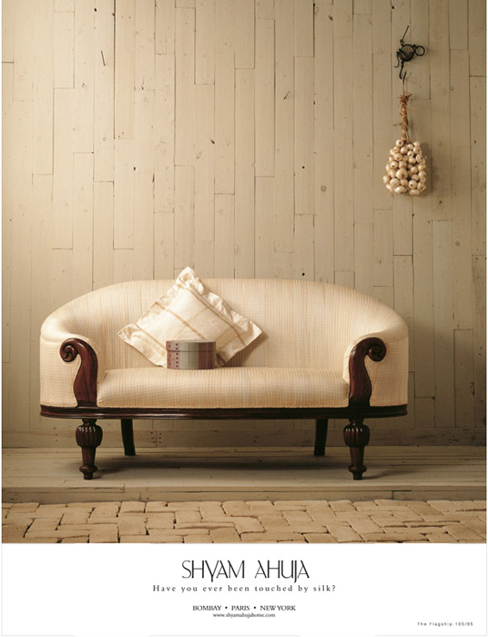

| We did mention earlier, didn't we, that the Karsondas campaign had caused our phone (our only phone at that time, goodness) to ring with exciting news? Mr. Ahuja, (yes, the Shyam Ahuja) expressed a desire to work with us. His brief was clear: I loved the campaign you did for Karsondas. Now give me just the opposite - the product experience instead of the India experience.
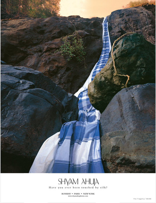
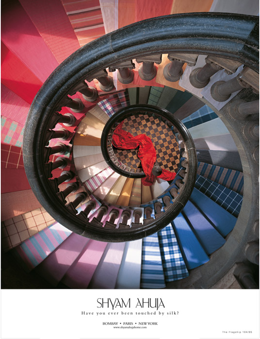
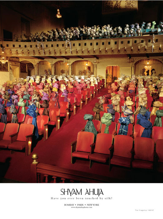
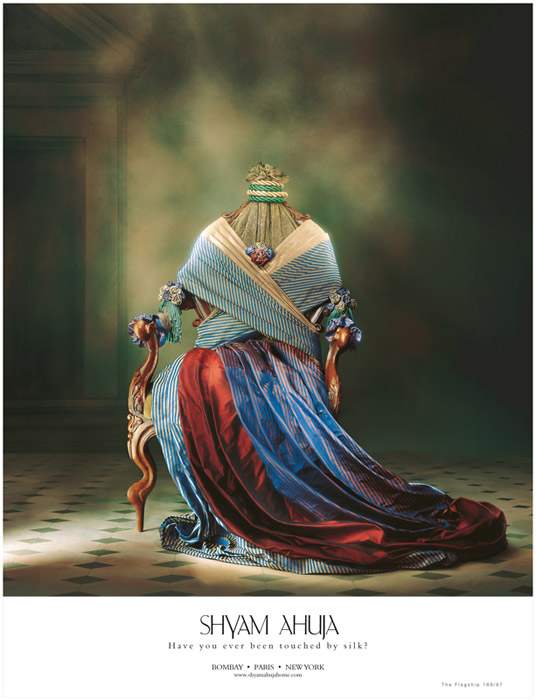
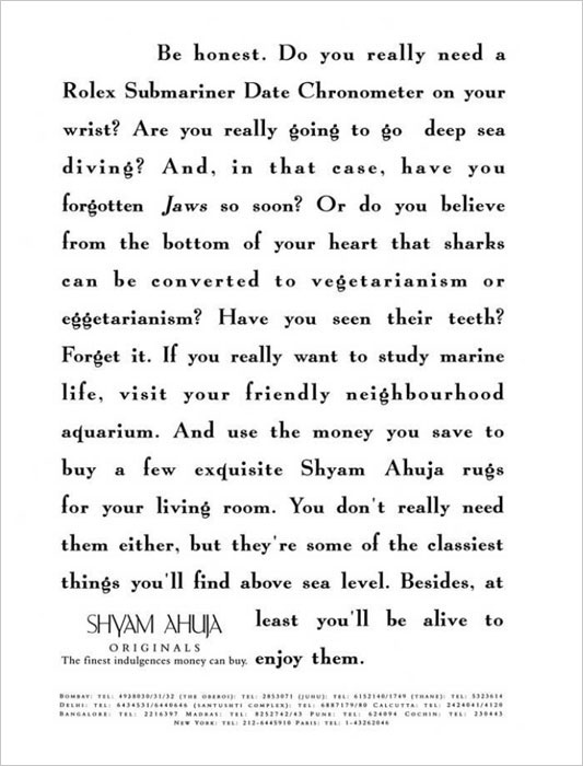
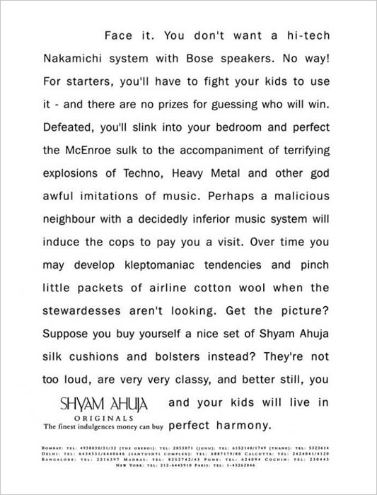
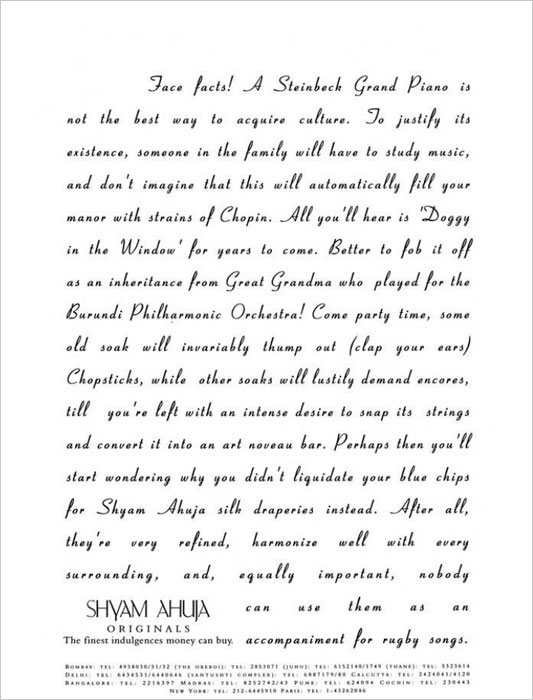
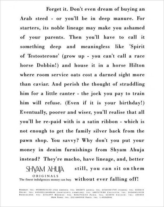
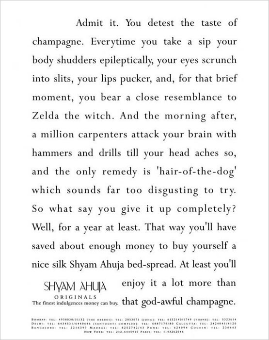
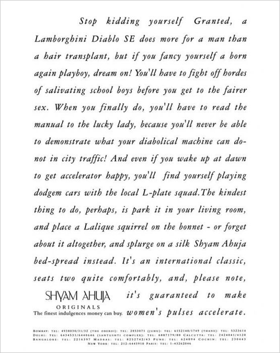
Doable. The only hitch was that Mr. Ahuja shuttled between Paris and New York -keeping track of his movements and co-ordinating time zones would have slowed the process considerably. Sunil Mahadik, our Art Director and Managing Director, decided to cut short the headache of toing and froing via faxes and phone calls by creating a simple but strong visual-led campaign with a common line running through: Have you ever been touched by silk? The richness and texture of flowing silks were captured beautifully in strikingly unusual situations. A spectacular waterfall to start with, keeping in mind that silks used for upholstery were rugged. The rest of the ads won appreciation too, and the sun was shining, birdies were singing, all was well with the world. And then, Mr. Ahuja gave the agency another opportunity to prove that it could think out of the box. The economy was opening up, more and more multinational companies were setting up plush offices in India, and elegant upholstery and durries would come in handy, right? Sunil did say, 'No problem'. However, he did not offer to run the same campaign. It was a hard-nosed business magazine, after all - there was a big chance the reader would skip the ads in favour of the articles. The strategy, therefore: Trick the reader into believing that he was browsing through an article. The agency delivered a witty, tongue-in-cheek typographical campaign that blended seamlessly into the pages to convey the sheer indulgence of owing Shyam Ahuja products. The logo was sneakily tucked into the left hand corner, instead of the right. When the campaign was presented, a chuckling Shyam Ahuja agreed that sometimes (just sometimes, of course) a thousand words can say it better than a picture. |
|
||||||||||||||||
 |
 |
 |
 |
 |
 |
